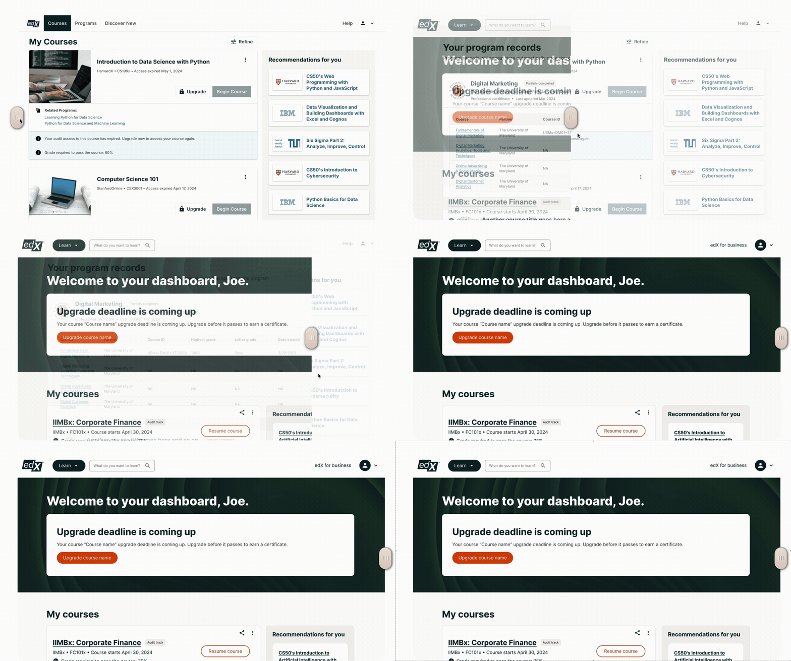
Before and after
Challenge
Background
After acquisition by 2U and rapid integration of the companies, edX b2c funnel metrics started rapidly declining. Product Design team hypothesized that we had lost touch with the learners and suggested a complete overhaul of the e-commerce experience.
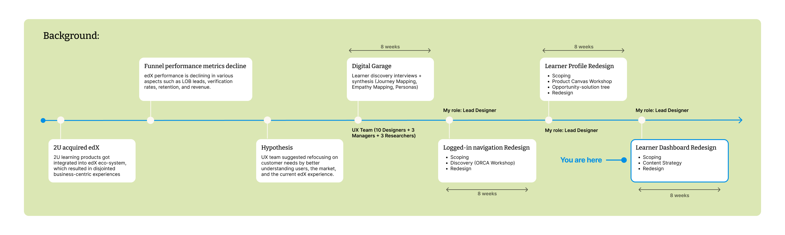
Project timeline and background
Problem
Research and data showed that learners:
- Struggle with course completion
- Need a clear learning path
Current state dashboard
The existing dashboard failed to support user goals identified during the Research phase of the project:
- Long list of courses with no hierarchy
- ORCA revealed that authenticated learners are directed to the marketing landing page (no space to market courses)
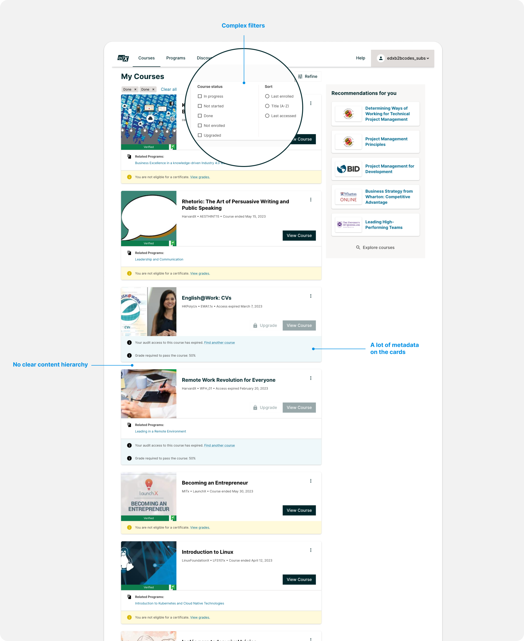
Dashboard before redesign
Content strategy
I mapped out the current breakdown of the content on the page, and re-arranged the content categories to match user goals to streamline content on the page and help users focus on what's most important.
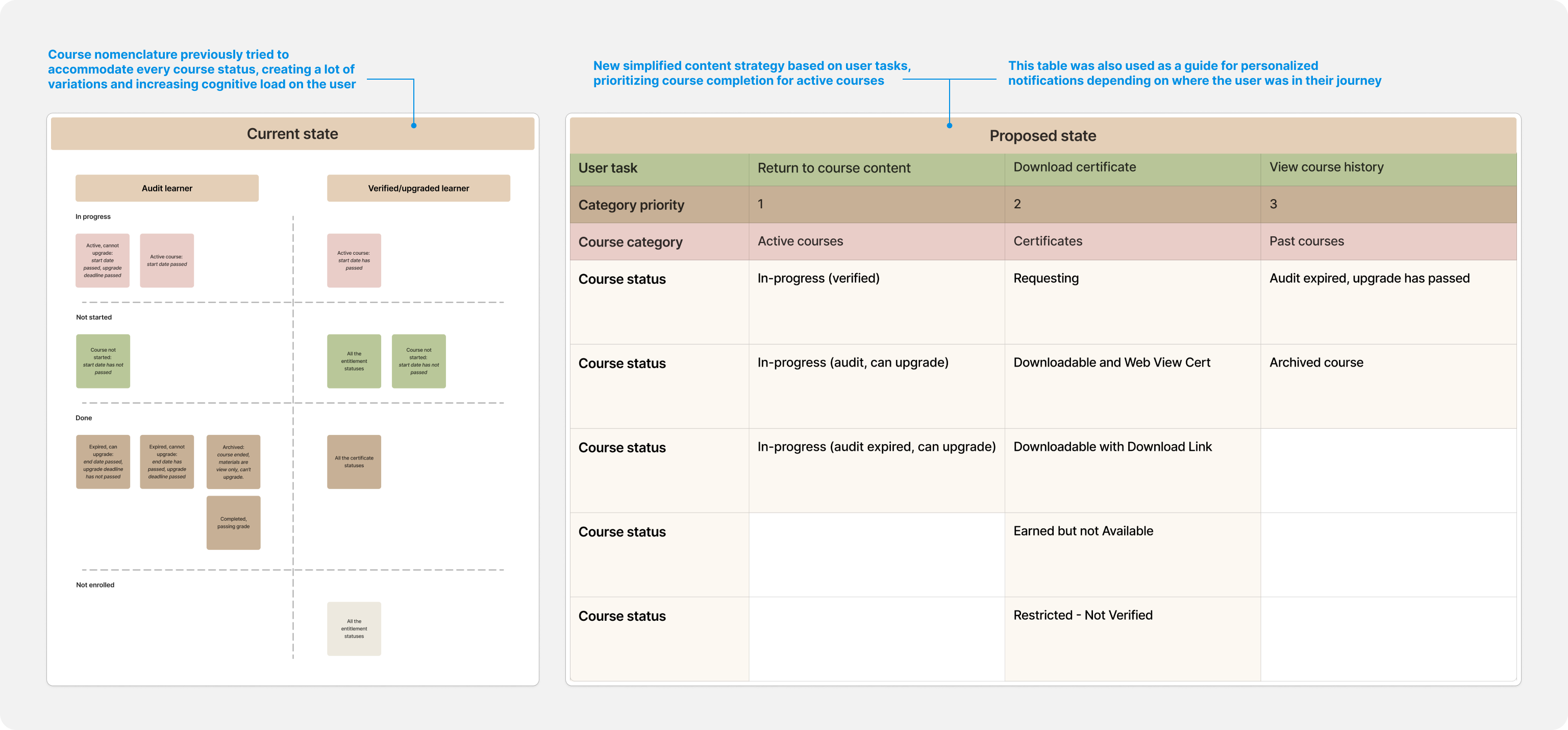
Dashboard content re-design
Dashboard aligned with user goals
- Visual weight follows importance. I designed the page to visually reflect the updated content strategy, allocating visual weight to each category and its cards based on their importance to users.
- Personalized top announcement area. It delivers both personalized learning recommendations and marketing updates, addresses the need for guidance, and allows users to bypass the landing page for immediate dashboard access.
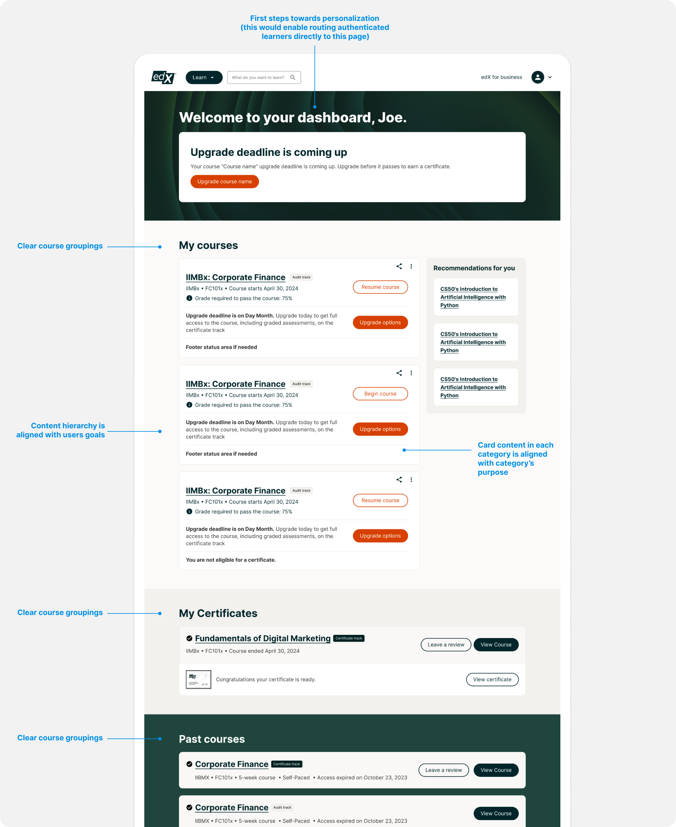
Re-designed dashboard
Learnings
User-centered design
This project highlighted the value of user-centered design in complex, business-driven environments.
Structured methods
Structured methods like ORCA and Design Thinking fostered effective cross-functional collaboration.
What I'd do differently
More frequent user testing and stronger use of data could have further improved decisions and sped up iterations.