The challenge
edX for Business is an online learning platform for organizations to train and upskill their employees.
Problem

Customer workaround to address a product gap
The Product team received continuous feedback from Sales and Customer Support teams that customers were concerned about new corporate learners' engagement on the platform. To address this, customers began creating manual email campaigns with course recommendations.
Solution
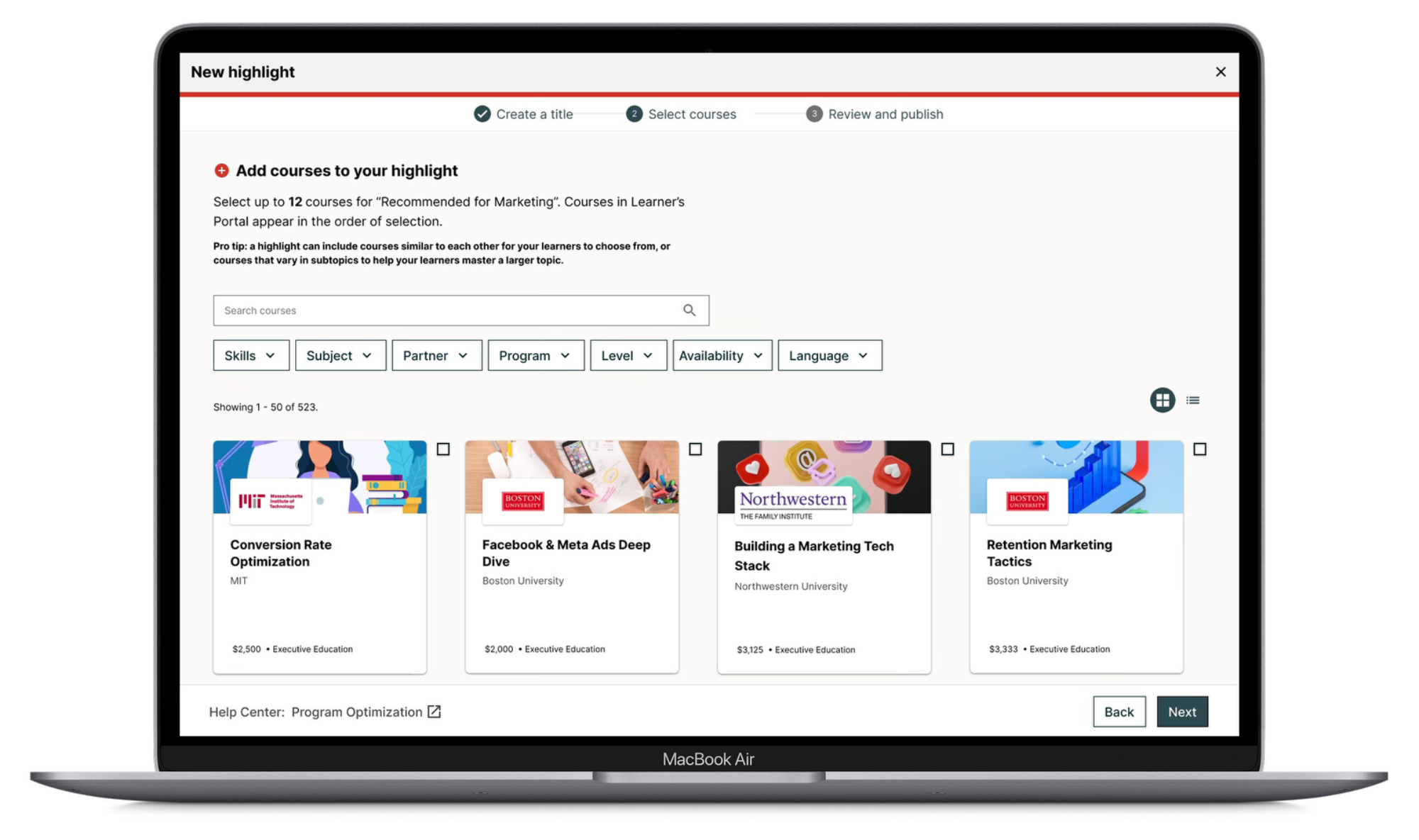
Highlights feature enabling in-platform recommendations
I designed a new feature ('Highlights') that enabled customers to recommend curated course collections directly on the edX platform. Additionally, I increased learner engagement by improving User Experience on the Learners platform.
Results
Discovery
Competitive analysis
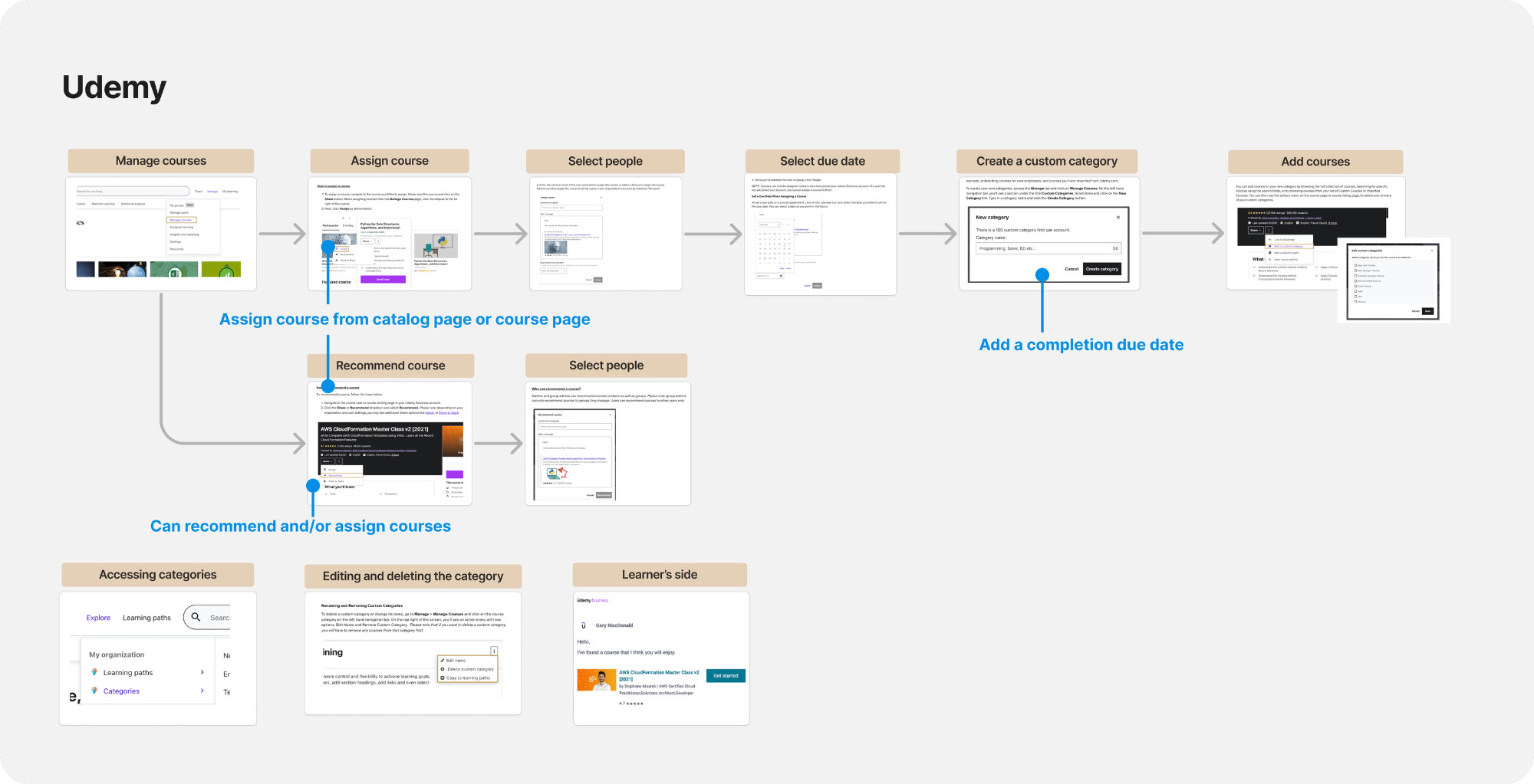
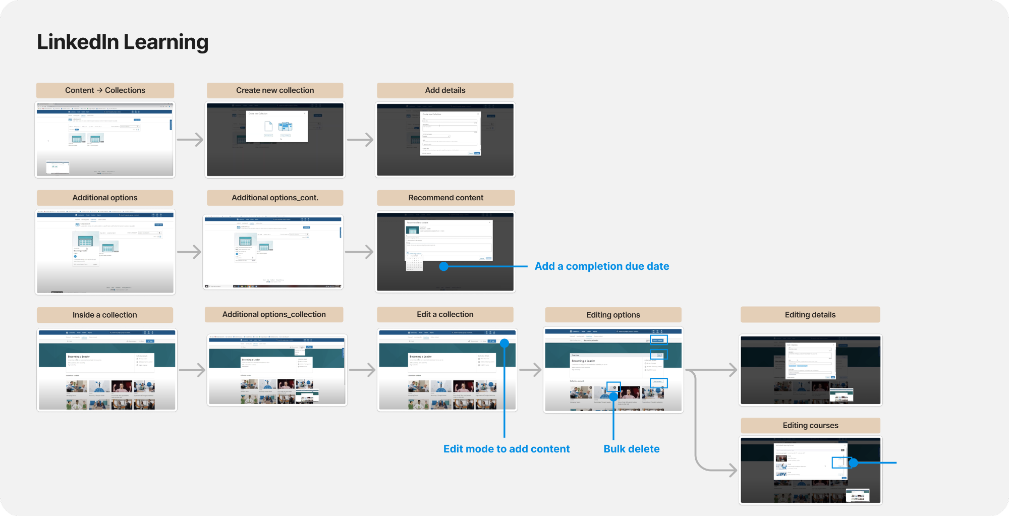
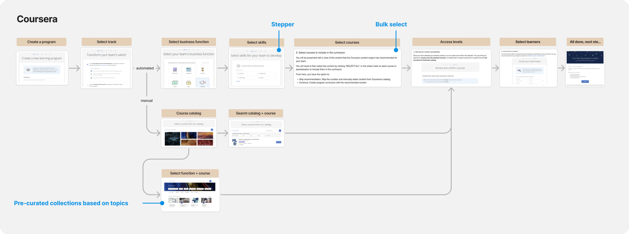
Analysis of direct competitors revealed a few potential directions.
Flexible approach (easy to assign and edit, but takes longer to build)
Streamlined approach (fast setup, pre-set collections, but not easy to edit)
Combined approach (step-by-step collection setup, but content is selected one by one)
Customer validation
Presented two concepts for feedback from Sales, Product, and Engineering.
Tradeoff: Streamlined but harder to edit vs. longer setup but more flexible.
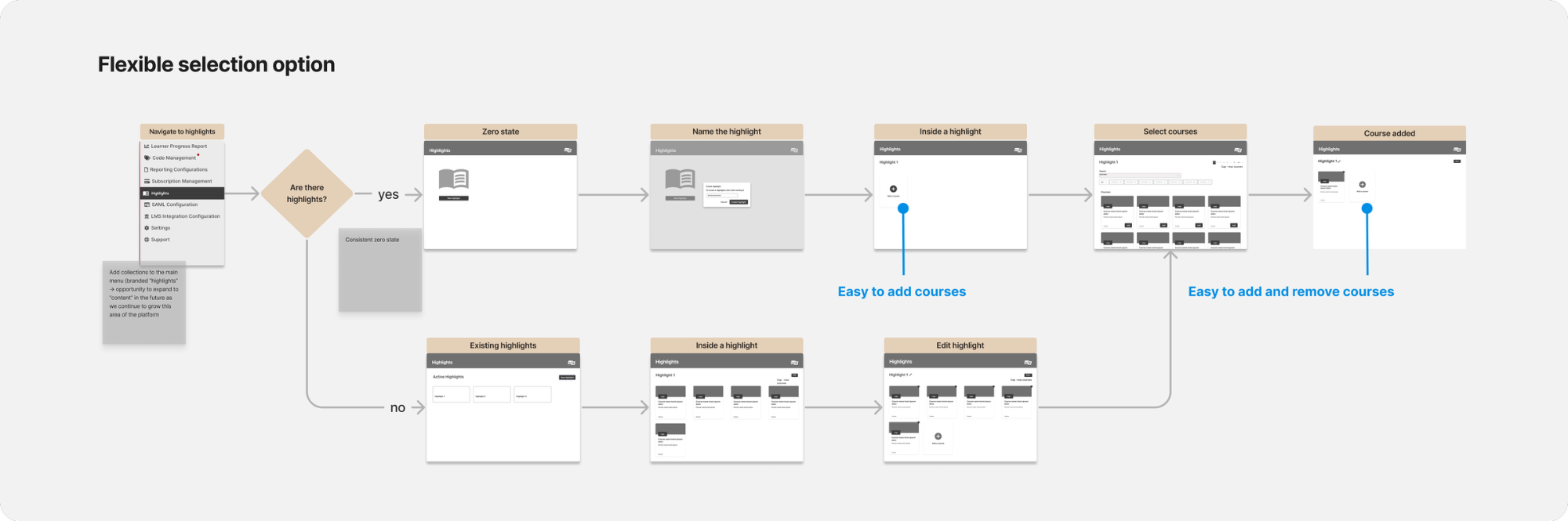
Concept A – streamlined approach
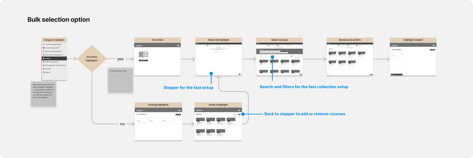
Concept B – combined approach
The feedback I received was that our customers prioritize a streamlined setup and rarely edit recommendations.
This insight helped me prioritize the streamlined approach for the MVP, focusing on speed and efficiency over flexibility.
Final solution
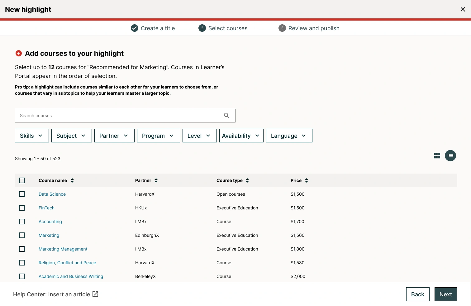
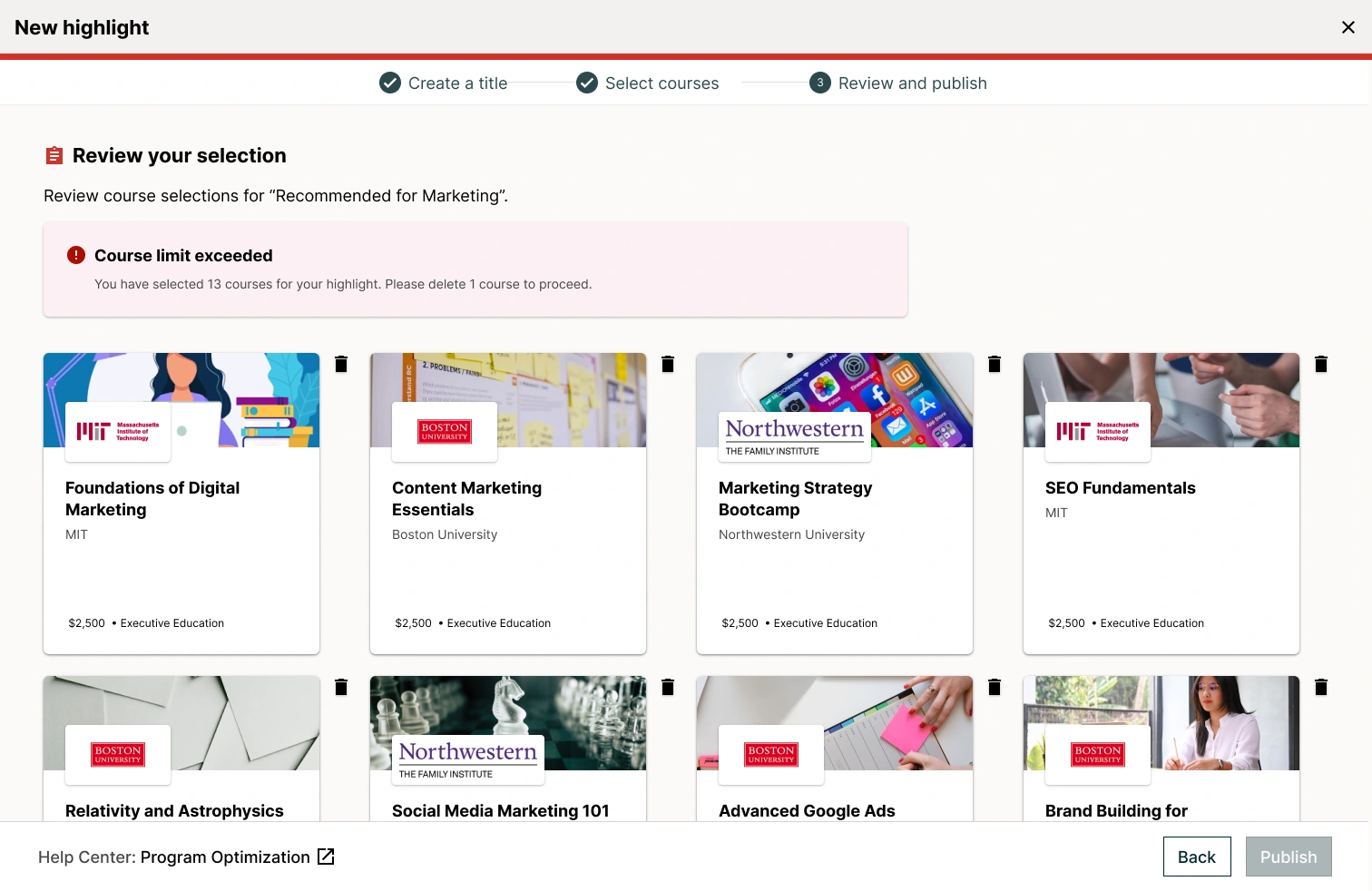
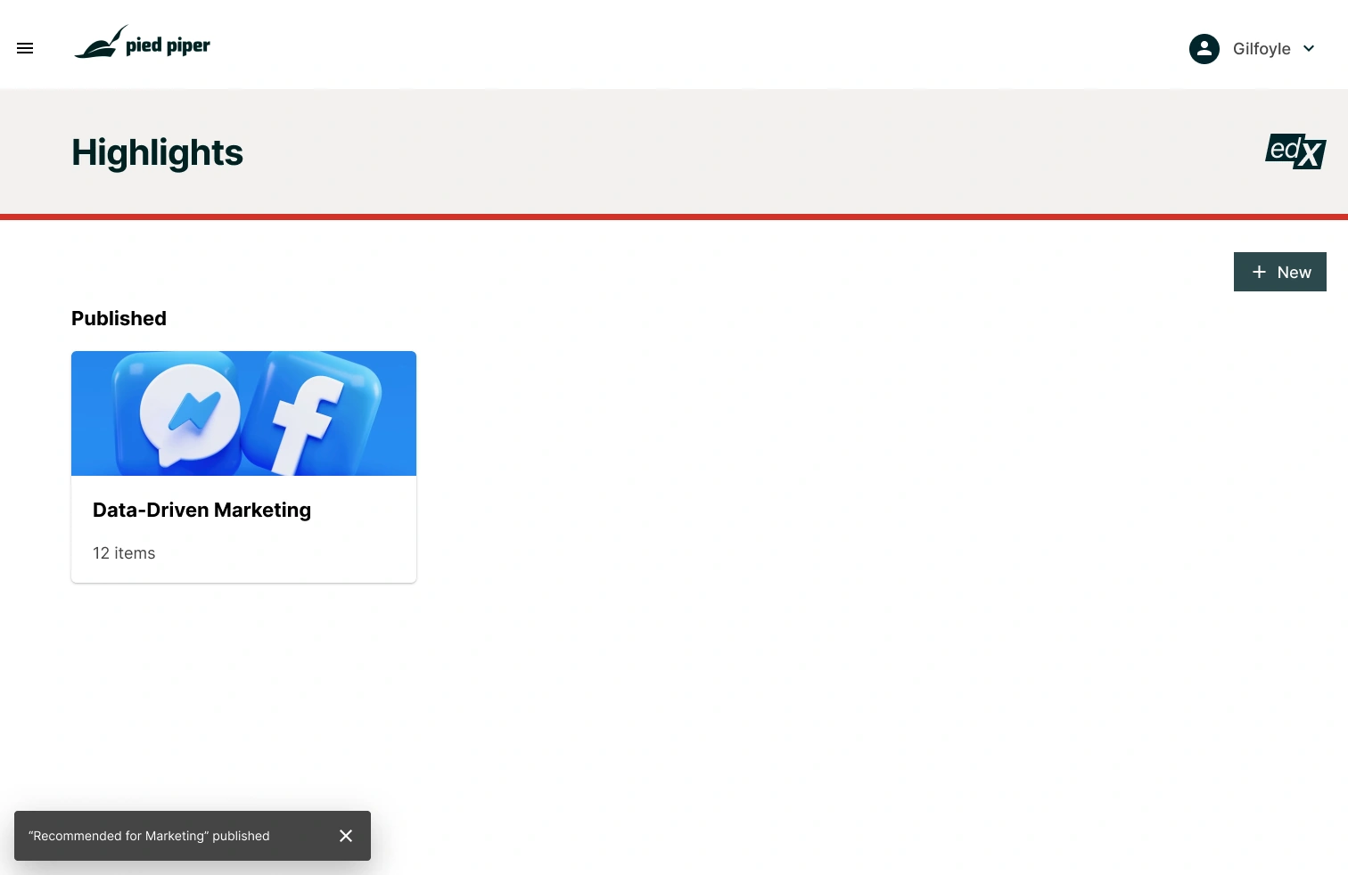
Prioritized streamlined approach and bulk selection for fast and efficient workflows.
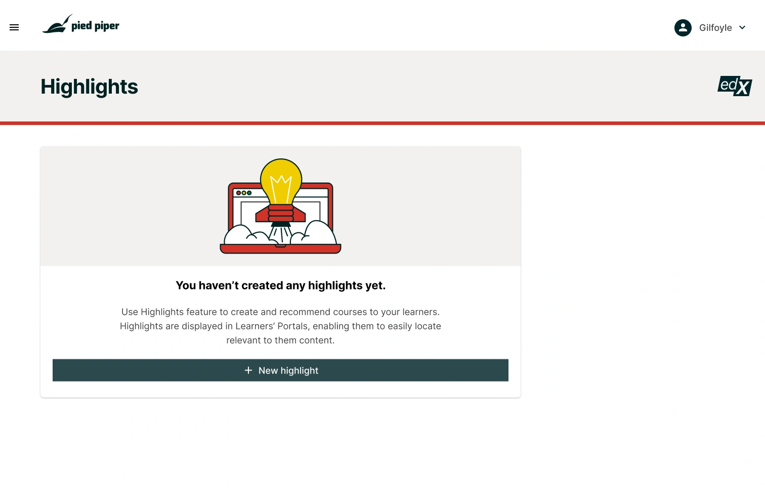
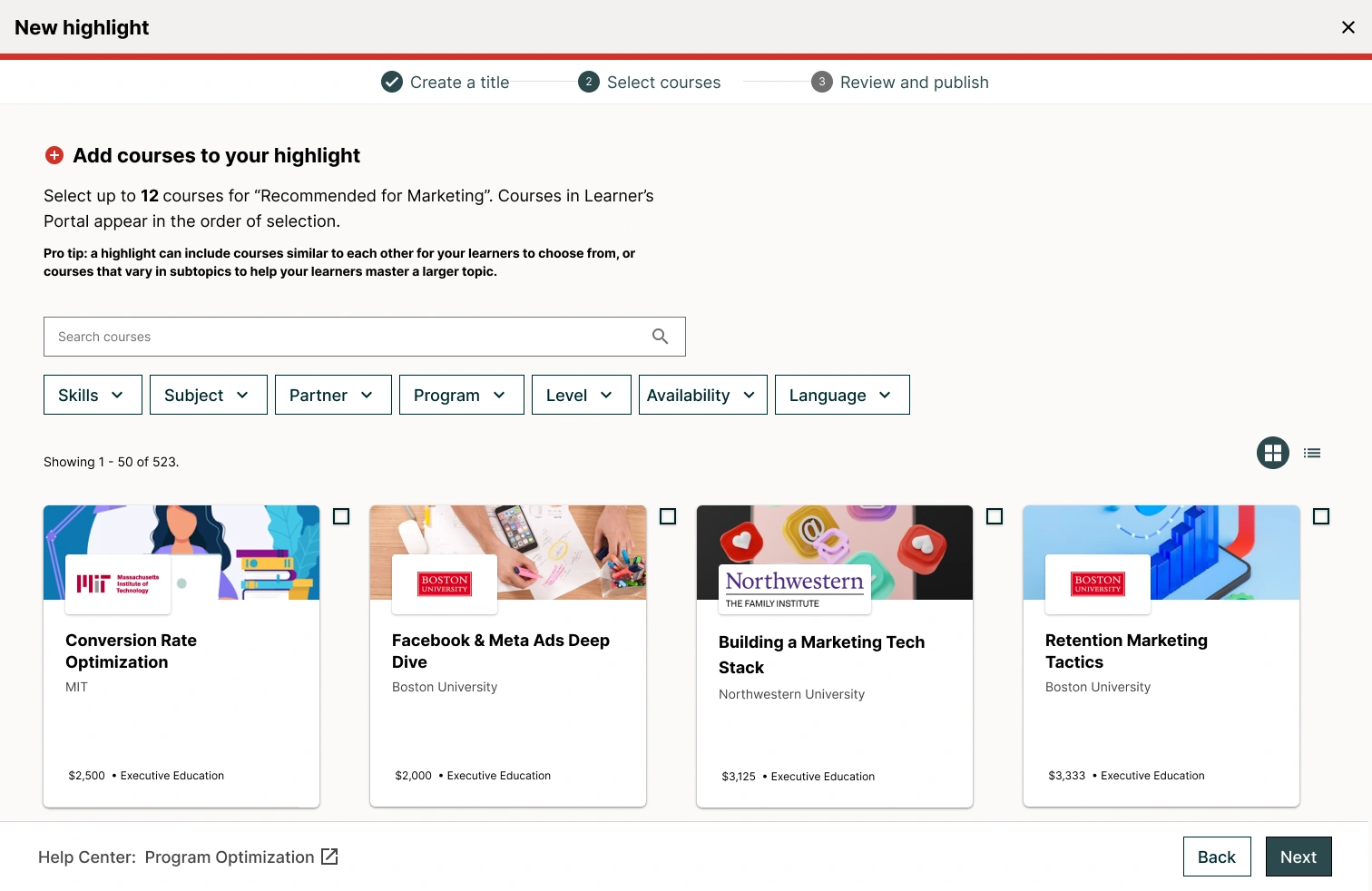
Learner-facing design
Designing a prominent, accessible discovery experience for learners.
Goal: Help learners discover curated course collections to increase engagement.
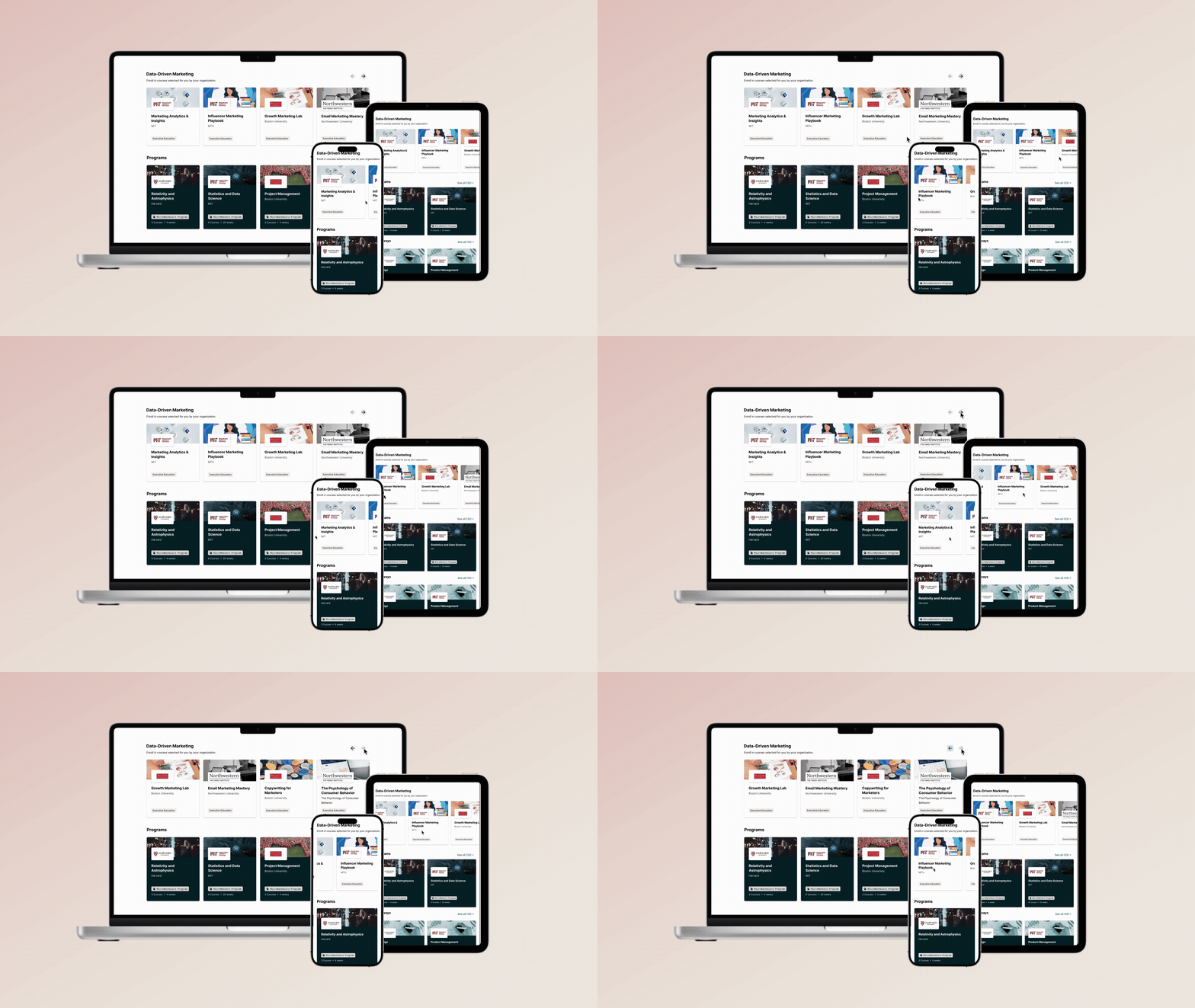
Highlights displayed at the top of "Find a Course" page
Current state assessment
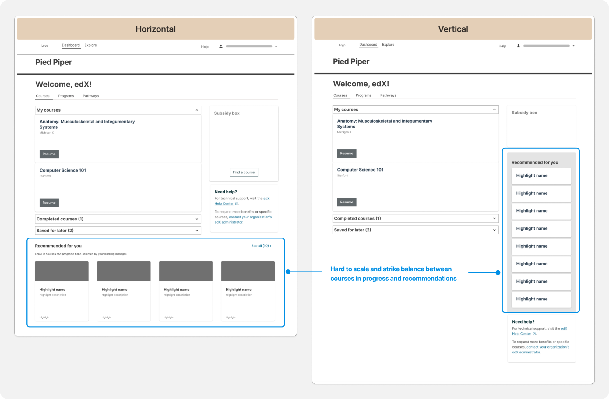
Initial explorations for placing recommendations at the start of the new learner flow revealed friction in the existing flow.
Redesigned flow
I proposed streamlining the experience by directing learners directly to the search page. A/B testing validated this approach, demonstrating increased engagement.
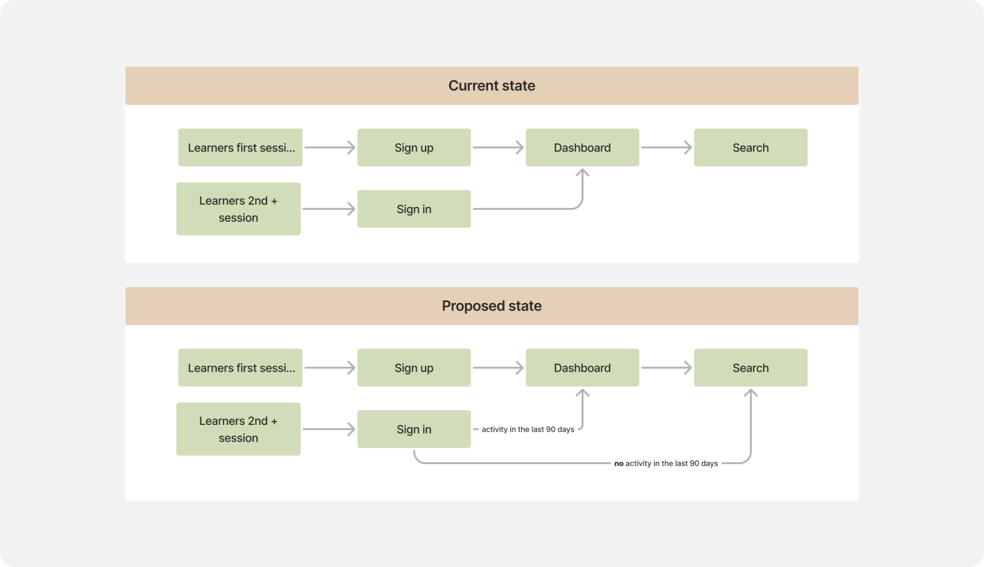
Redesigned flow
Focus on enrollment
For design concepts, I focused on balancing collection overview and individual course appeal. A/B testing 3 options confirmed that carousel design maximized engagement and enrollment.
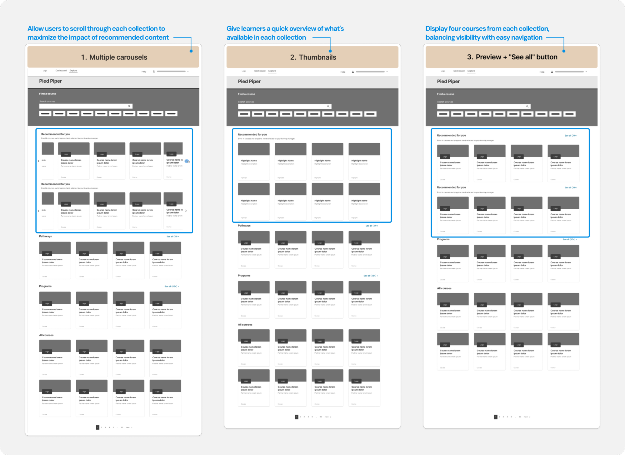
Explorations on Search page
Clickable prototype
Learnings & next steps
What I learned
Working within tight constraints taught me to prioritize ruthlessly and leverage existing research effectively. Sales insights and competitive analysis can substitute for traditional user research when time is limited, but documenting future enhancements ensures you're building for long-term success.
What I'd do differently
If given more time, I would have conducted usability testing with actual customers before finalizing the streamlined approach. While the feedback validated our direction, hands-on testing would have surfaced edge cases and helped us prioritize features earlier.